Gibson Funerals
BRAND IDENTITY & SQUARESPACE WEB DESIGN
Proudly family-owned, Gibson Funerals serves the Waikato Region with warmth, dignity, and genuine care. Rooted in community, they create bespoke, meaningful services that honour each life in a way that feels authentic and true.
“The feedback we’ve received on our marketing has been overwhelmingly positive, and we credit this to the expertise and creativity of Studio G.”

What did I achieve for Gibson Funerals?
BRANDING
Brand Strategy
Moodboard
Colour Palette
Logo Design (Primary, Secondary, Brandmark & more)
Font Family
Brand Guidelines
Launch Posts
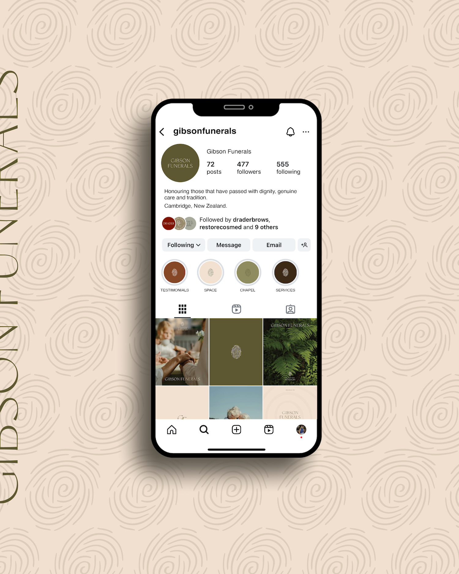
Social Media Posts & Styling - 9 initial tiles
WEB DESIGN
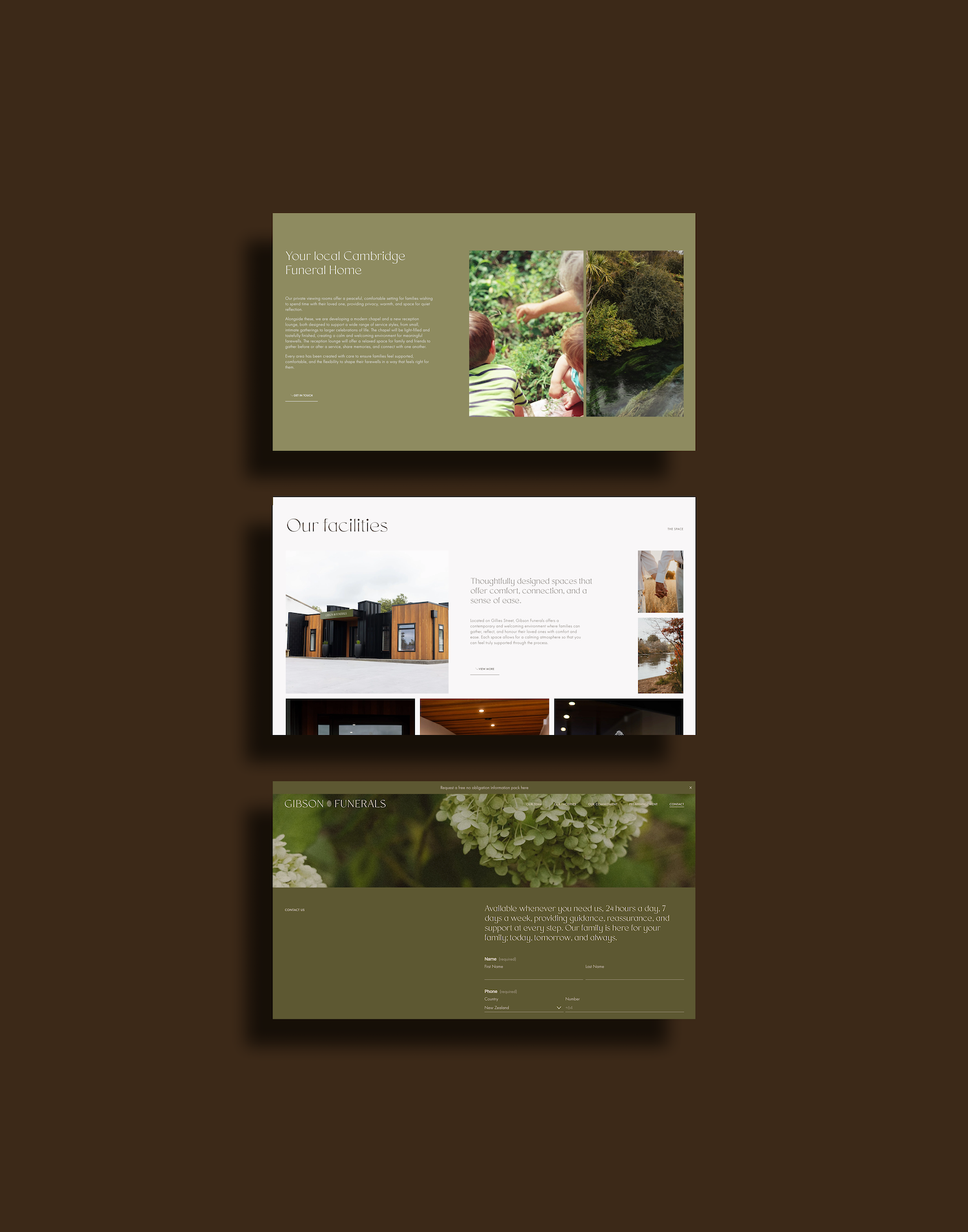
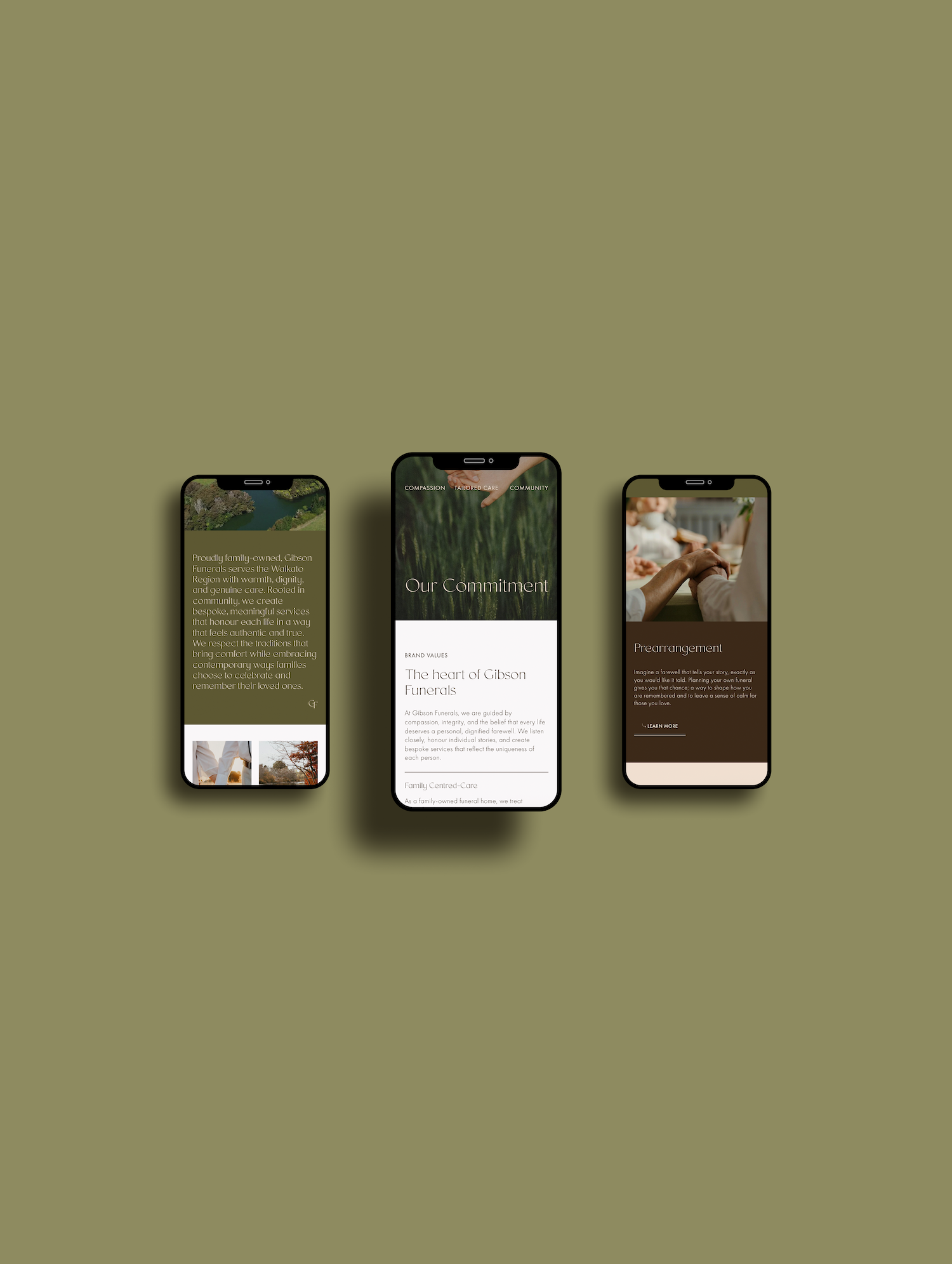
7‑Page Squarespace Website
Contact Form
Prearrangement Form
Custom Font Installation
Web Favicon Design
Domain Set-up
Sourcing Stock Imagery
Artistic insertion of the Gibson Funerals new brand identity
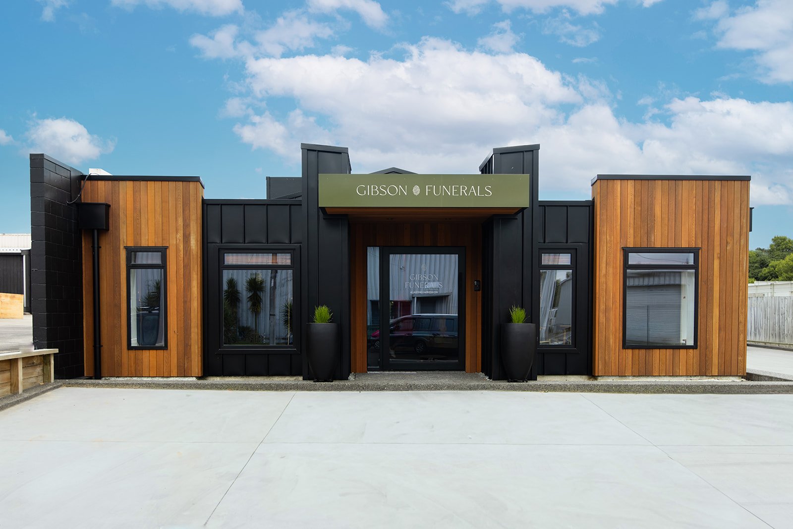
When Jono Gibson made the decision to step out on his own and establish a new funeral home in Cambridge, New Zealand, the vision was clear: create a space that felt warm, welcoming, and deeply connected to the local community. As a tight-knit town where relationships matter, it was important that Gibson Funerals felt both familiar and refreshingly new.
We began at the end of 2025 with in-depth brand strategy — defining who Gibson Funerals would serve, how they would show up, and what emotional experience they wanted to create. The direction was inviting, calm, nurturing and approachable. Through competitor analysis, we identified a gap in the market: many funeral brands leaned either overly corporate and clinical, or dated and traditional. Gibson Funerals would sit confidently in between — modern, warm and timeless.
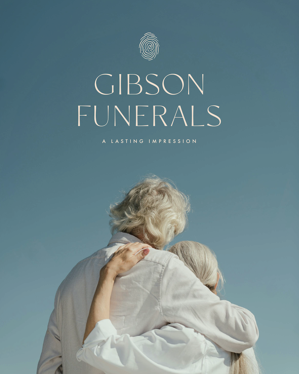
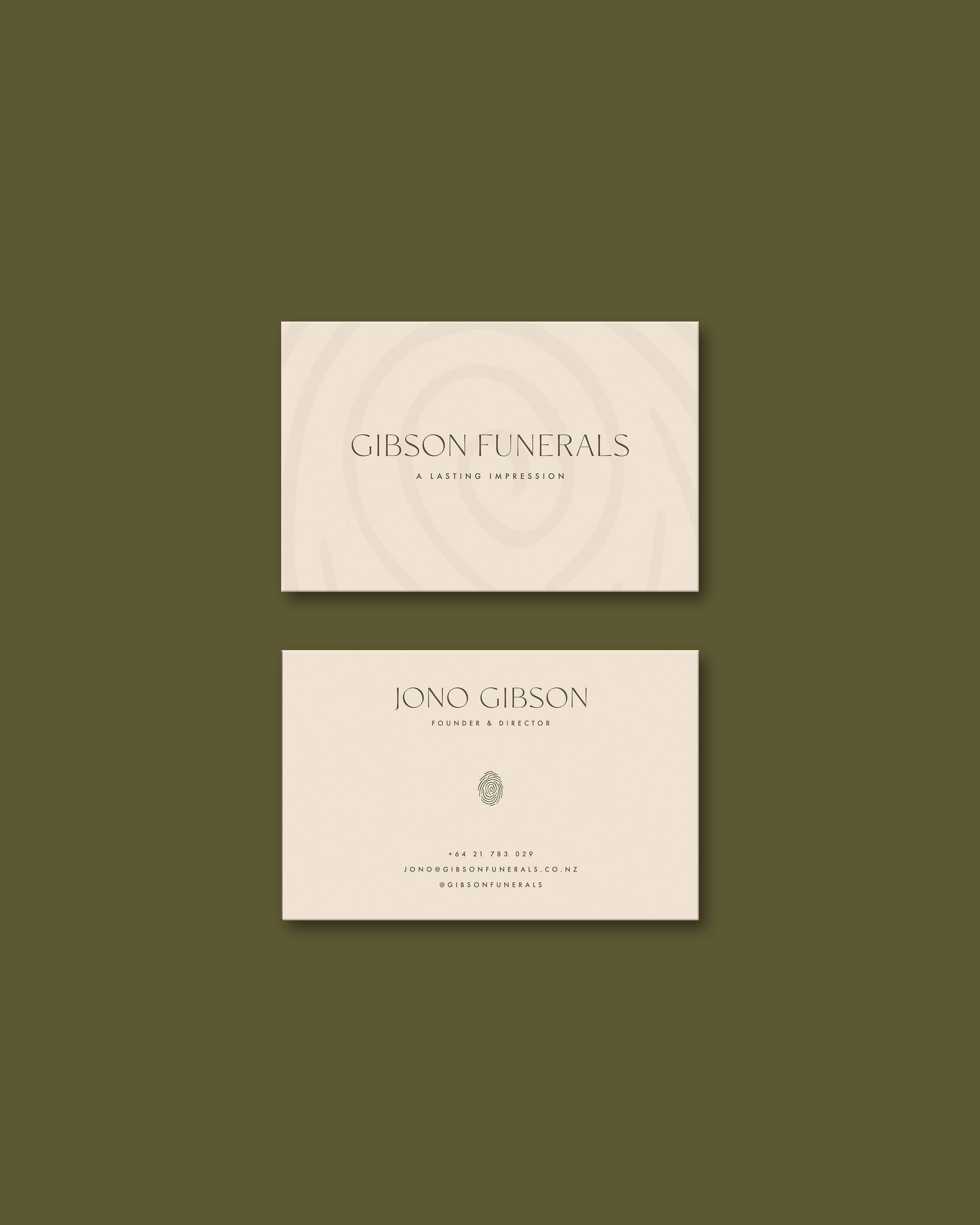
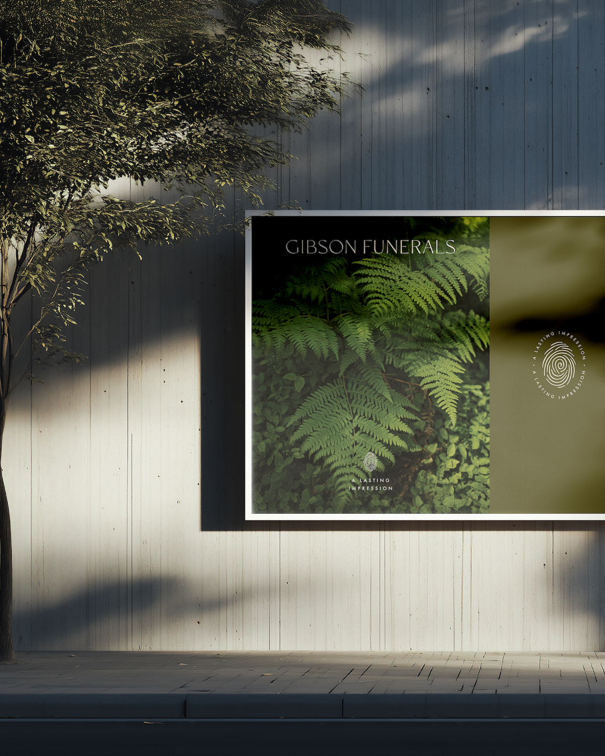
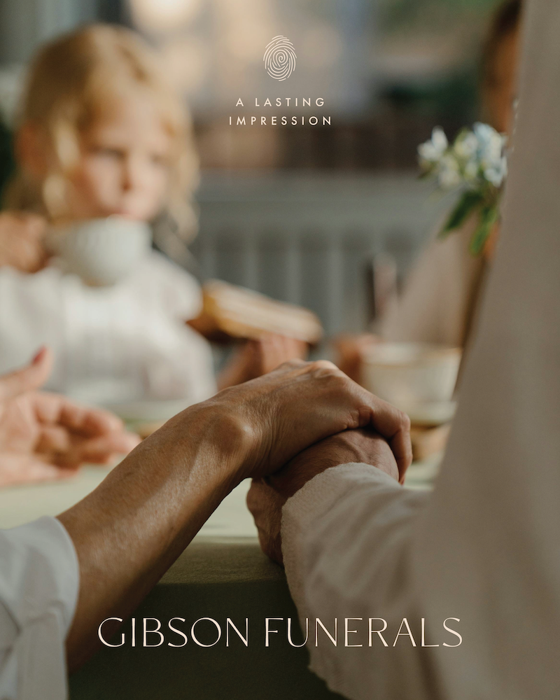
The visual identity draws inspiration from the inland New Zealand landscape surrounding Cambridge. A grounded palette of layered greens and earthy browns is balanced with soft off-whites for contrast. Imagery direction centres on connection — families, couples, gentle interactions and moments in nature — reinforcing the brand’s core value of community.
Typography was carefully selected to feel refined yet delicate: a clean, modern sans-serif with subtle stroke variation that brings movement and softness, while remaining timeless and sophisticated.
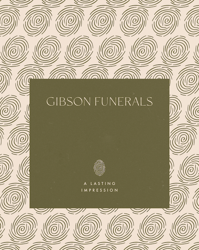
The logo concept brings powerful symbolism together. Inspired by the koru — reflecting growth, renewal and the cycles of life — its flowing lines are interwoven with the form of a fingerprint. The fingerprint represents the unique imprint we leave on others, while the layered circular lines speak to the many chapters, stories and years that shape a life. The result is a mark that feels deeply personal, fluid and meaningful.
Following the brand rollout, we implemented the identity across social media, designing a cohesive launch grid that set the tone for the business from day one. The website followed — a thoughtfully structured seven-page Squarespace build designed to feel simple, calming and intuitive. Clear navigation, accessible information and integrated enquiry forms ensure ease of use during what is often a tender time.
Stock video and imagery were carefully curated to blend seamlessly with professional photography of the new premises and team, creating a cohesive and polished digital presence.
The final outcome is a brand and website that feels distinctly Gibson Funerals — warm, contemporary and community-led. A fresh approach within the funeral space, grounded in meaning and connection.